-
Type:
Bug
-
Status: Done
-
Priority:
 Medium
-
Resolution: Done
-
Affects Version/s: None
-
Fix Version/s: Enhancements - Fall
-
Labels:None
-
Company:All Clients/Multiple Clients
-
Sprint:DMS - Fall Sprint 7, DMS - Fall Sprint 8, DMS - Gap Fall & Win Sprint 1, DMS - Gap Fall & Win Sprint 2, DMS - Gap Fall & Win Sprint 3, DMS - Gap Fall & Win Sprint 4
Hi Mohd Belal
Below are the UI observations on Stage: https://dmsstage.workterra.net/
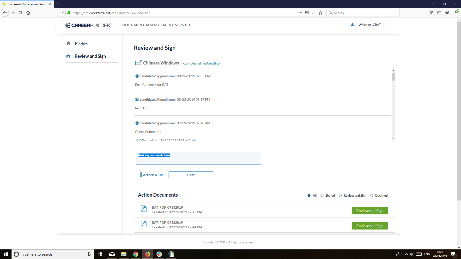
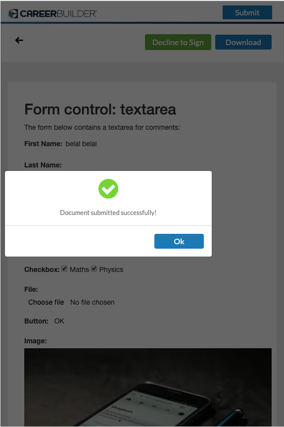
1. White space from top side of signed buttons in Action documents.
2. Drop-down arrow of actions is if aligned right, need to add padding-right.
3. Left and right padding is not equal.
4. Top-bottom padding needs to increase as per mock-up.
5. Mail id and title not aligned from left side as well ass post comment and attach file.
6. Documents and Review and Signed button not aligned in single row in iPad view.
7. Top-bottom padding is not consistent in review and sign pdf view etc.
Please check and let me know if you have query.
Regards,
Namrata
Samir Priya Dhamande
- blocks
-
DMS-1139 Review and Sign: New UI & Mobile Responsive
-
- Done
-

