-
Type:
Bug
-
Status: Done
-
Priority:
 Medium
-
Resolution: Done
-
Affects Version/s: None
-
Fix Version/s: None
-
Labels:
-
Company:All Clients/Multiple Clients
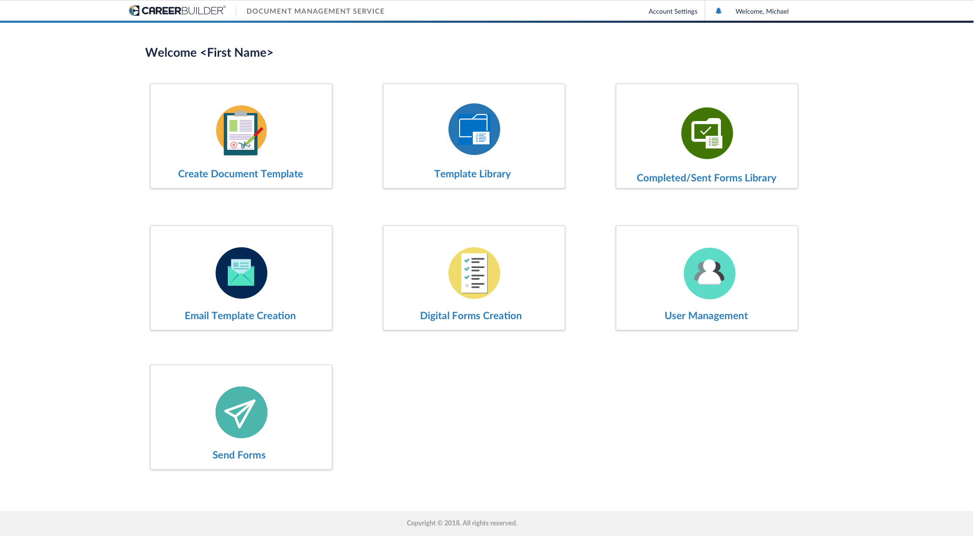
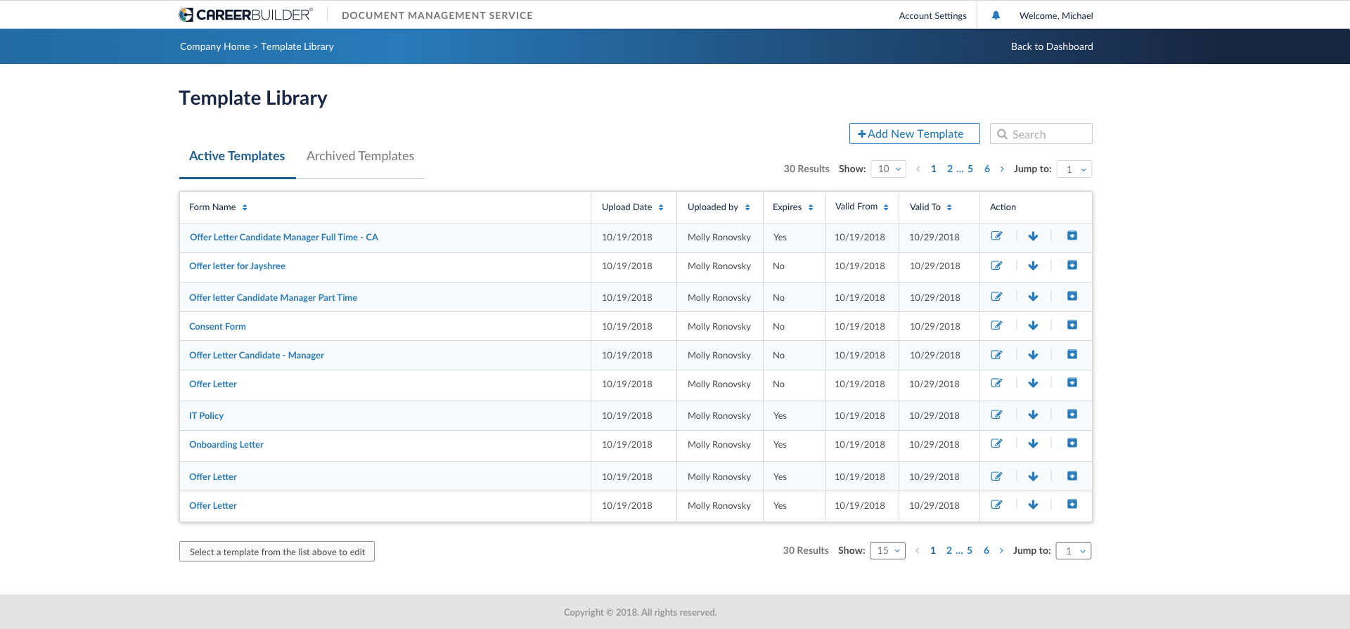
Dashboard
Molly's comment: The standard dimensions for the site – still seems like everything is super big / stretched?
Need to have margins on either side.
Aruna Raheja Swapnil Pandhare Smita Pawar


Hi Molly Ronovsky,
Can you please update screenshot from your machine for dashboard screen?
Thanks,
Swapnil P.
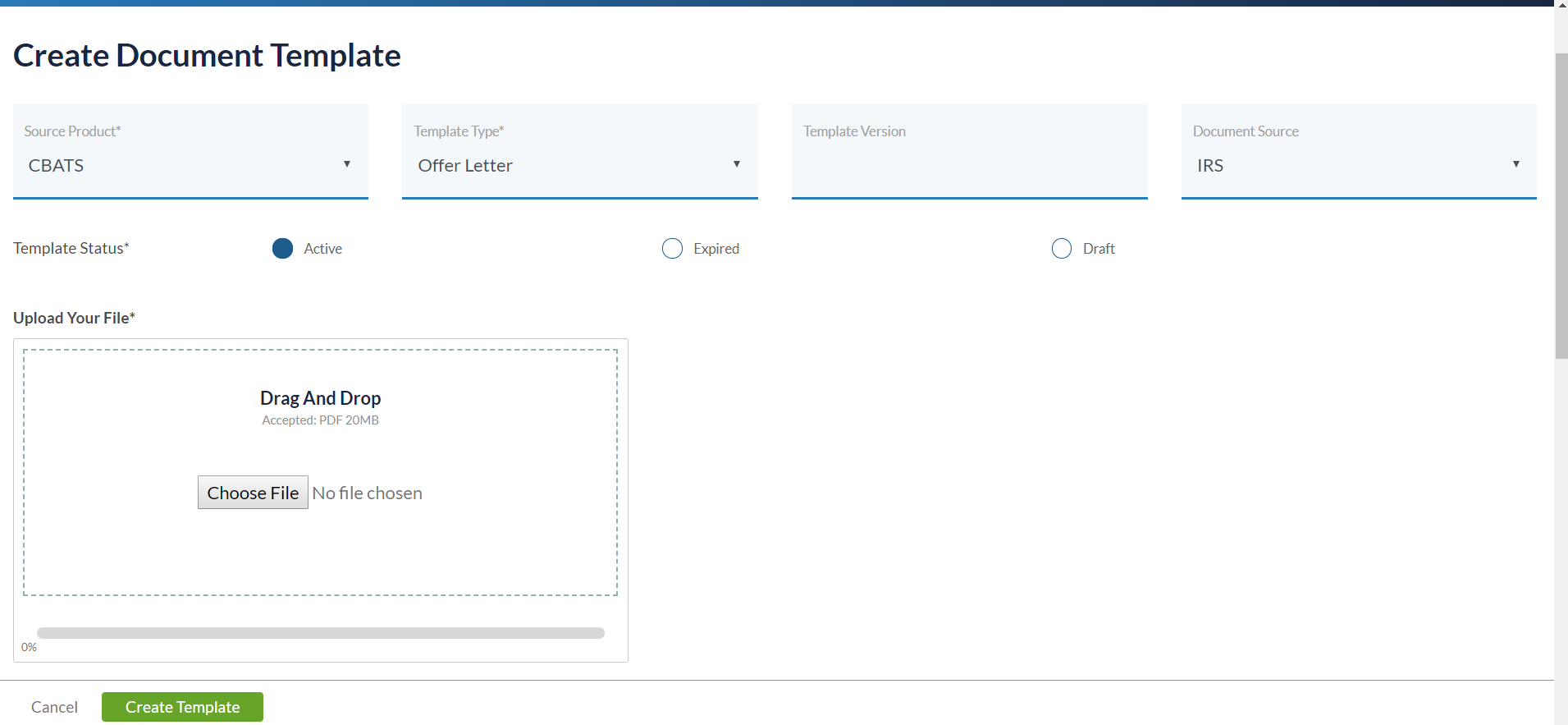
Below is the screenshot - everything seems very big and spaced out. There are no 'bumpers' on the sides / do not match Aruna Raheja mock-ups. You can also see on the create template that the template status buttons are super spread out. Let me know if you need any other details?

Hi Molly Ronovsky,
1. Dashboard:
- Due to responsive behavior, boxes are spanned across. If we restrict the width, then on larger screens there will be extra white space from left and right side. In current scenario, width will vary as per the screen resolution. Please find attached screens for different resolutions(Large (1920px) and small(1024px)) for more clarification. Let me know your thoughts on the same.
- Regarding bumpers on the sides, I have updated the space as per mockups and will ask DEV team to up the chnages.
2. Create Template- Buttons are super spread: **As per my understanding, you are pointing Radio buttons. I'll look in to this and adjust the spacing in between.
Aruna Raheja Kristen Can you two please take a look at this? I'm not following the question - but to me it still seems off from CB standards, as well as very big. Also, some items like selecting reference or signature doc still have an awkwardly big space? I'm assuming that isn't standard.
Smita Pawar : Kindly share the pre-prod URL, so that we can check the same.
 Aruna Raheja
added a comment - Smita Pawar : Kindly share the pre-prod URL, so that we can check the same.
CC: Kristen Swapnil Pandhare Samir
Aruna Raheja
added a comment - Smita Pawar : Kindly share the pre-prod URL, so that we can check the same.
CC: Kristen Swapnil Pandhare Samir Aruna Raheja, Please find details below for Preprod:
URL: http://40.124.26.81:90/login
Username: jayshree
Password: Password@321
Hi Aruna Raheja,
Have you checked the Dashboard? Please let me know if any updates.
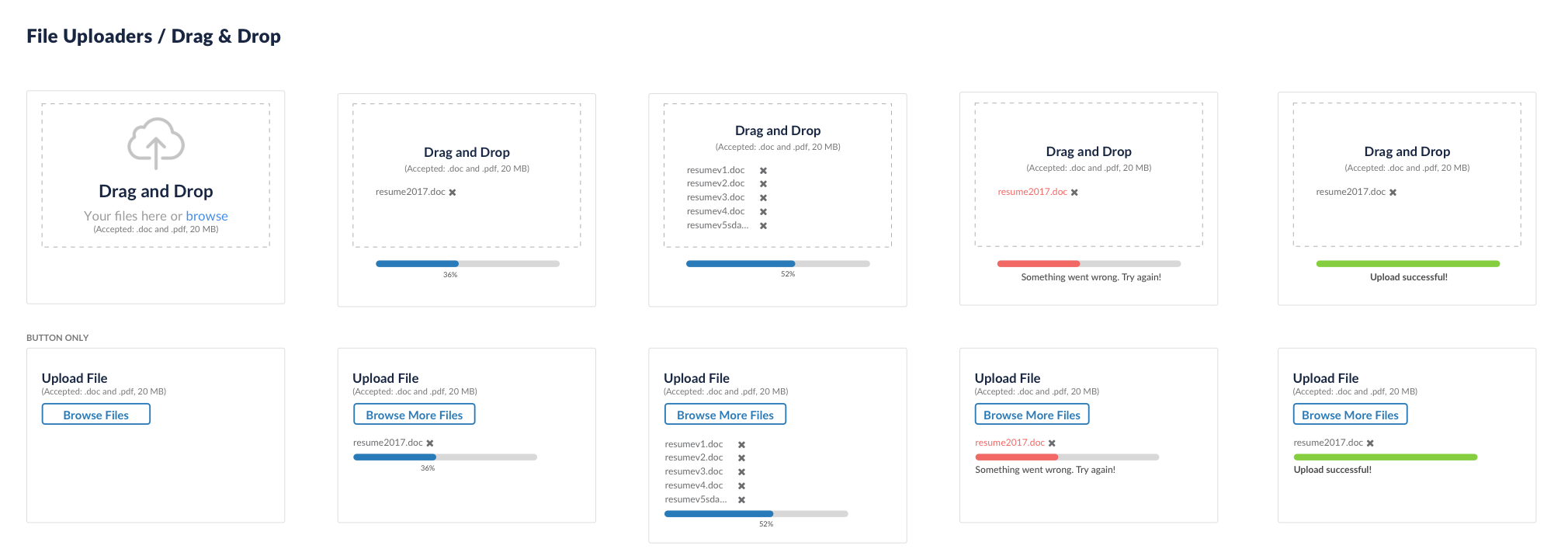
Smita Pawar : Drag and Drops are not as per the mockups. Attached is the screenshot of mockups of Drag and Drop for your reference.

For boxes, as per me we need to fix the width of boxes and gutter space can increased but i need to check with @Kristen on this.
Kristen : Can you please have a look on this. Here are the credentials
URL: http://40.124.26.81:90/login
Username: jayshree
Password: Password@321
Aruna Raheja
added a comment - Smita Pawar : Drag and Drops are not as per the mockups. Attached is the screenshot of mockups of Drag and Drop for your reference.
For boxes, as per me we need to fix the width of boxes and gutter space can increased but i need to check with @Kristen on this.
Kristen : Can you please have a look on this. Here are the credentials
URL: http://40.124.26.81:90/login
Username: jayshree
Password: Password@321 Aruna Raheja I tried logging in to interact with it, and it gave me a system error saying I could not be logged in.
Also, the log in page, everything seems very large. The text input boxes are massive and the sing in button is below the fold because of it. It wasn't like this in the designs, and dev should probably fix it as to not confuse users.
Kristen I keep saying / noticing the same thing and have reported to dev.
Smita Pawar : Here is the revert from @Kristen -
As for the odd spacing issues, the dev team may want to set a min/max size for the tiles to collapse or expand to. Increasing the gutter size should help it to feel not as awkward as well.
Aruna Raheja
added a comment - Smita Pawar : Here is the revert from @Kristen -
As for the odd spacing issues, the dev team may want to set a min/max size for the tiles to collapse or expand to. Increasing the gutter size should help it to feel not as awkward as well.
CC: Molly Ronovsky Can I have the sample mockup for large resolution considering this comment?
Smita Pawar : We need to take maximun of 359px width for a tile. I have attached a mockup with 1920px width for your reference.
Aruna Raheja
added a comment - Smita Pawar : We need to take maximun of 359px width for a tile. I have attached a mockup with 1920px width for your reference. Aruna Raheja, Thank you, will update the HTML. Just to confirm, here we have increased spacing between the boxes compare to other resolutions, so it'll vary depending upon the resolution and cause the inconsistency. If that is fine then will implement the same.
Smita Pawar : Please call me to discuss this
Aruna Raheja
added a comment - Smita Pawar : Please call me to discuss this Hi Aruna Raheja,
Please find attached screenshot for large resolution, I have fixed the boxes width and aligned those in to center to keep gutter spaces same from left and right. Will keep Page title and Logo at same position as per the other pages.
Please check and confirm.
Hi Smita Pawar,
It is looking fine to me. Kindly update logo and Page title on the exact position then share the screen with Molly Ronovsky and Kristen to take there feedback.
Aruna Raheja
added a comment - Hi Smita Pawar ,
It is looking fine to me. Kindly update logo and Page title on the exact position then share the screen with Molly Ronovsky and Kristen to take there feedback. Hi Aruna Raheja
As I mentioned earlier, will not change the position for Logo, right side navigation and page titles. We have to maintain consistency throughout. I am comparing dashboard with other pages. Application is responsive and we have used fluid grids. If I change the logo and other links for dashboard then what will be the behavior for other pages?
I will connect you to discuss this in detailed.
Hi Aruna Raheja, Kristen
Please find attached screen with adjusted tiles for larger resolution. Will be showing four tiles in a row. Please check and confirm.
Resolution-Large-Tiles-Adjusted.jpg
Smita Pawar It looks fine to me. Please share both screens (with 4 tiles and with 3 tiles have large gutter space) with Molly Ronovsky for her approval.
Aruna Raheja
added a comment - Smita Pawar It looks fine to me. Please share both screens (with 4 tiles and with 3 tiles have large gutter space) with Molly Ronovsky for her approval. Aruna Raheja, As per me we should not go with huge gutter space and Logo, navigation placement changes as it is difficult to manage on other pages with that space. Hence attaching only one with four tiles.
Smita PawarAruna Raheja The one with three across looks much better? I sent feedback in email too.
Hi Molly Ronovsky,
Can you please check the attached screen with three tiles in a row. Screenshot is considering large resolution 1920px.
Please confirm.
Smita PawarAruna RahejaKristen
I think that is a bit better thoughts aruna and kristen?- does the placement of the word Dashboard need to change?
Aruna Raheja Smita Pawar
Aruna's mock-up looks good- as well we need to have a comma after Welcome, name to match the top right corner message.
Smita Pawar, Aruna Raheja, Molly Ronovsky 'Dashboard' should probably align with the first tile on the left. It looks a little odd all by itself on the left
Hi Swapnil Pandhare,
I have updated HTML and CSS, we need to integrate the changes in to DEV environment. Please assign it to DEV member, I'll coordinate.
Hi Aruna Raheja,
As per our discussion regarding the Logo and right navigation placement for the larger resolutions, can you please update the visual for one of the internal screens with large amount of data? Once we get the approved screens, I'll accommodate the changes throughout application.
As per me, for larger screens as well we should have the standard behavior, considering responsiveness of the application. Here for larger screens we are restricting the area.
CC: Kristen, Swapnil Pandhare
Smita Pawar : Please find attached mockups for 2 pages. Let me know if you have any queries.
Molly Ronovsky : Kindly review.
CC: Kristen Swapnil Pandhare Molly Ronovsky Samir Priya Dhamande
Aruna Raheja
added a comment - - edited Smita Pawar : Please find attached mockups for 2 pages. Let me know if you have any queries.
Molly Ronovsky : Kindly review.
CC: Kristen Swapnil Pandhare Molly Ronovsky Samir Priya Dhamande Aruna Raheja Which should I be looking at - I cannot tell which are new? As well, did you see my comment that if we say 'Welcome, Molly!' we need to have punctuation...
Molly Ronovsky : PFB for your reference, we have only kept 1920px screens here.
For Punctuation Smita Pawar is looking into the same.
Aruna Raheja
added a comment - Molly Ronovsky : PFB for your reference, we have only kept 1920px screens here.
For Punctuation Smita Pawar is looking into the same.
Aruna RahejaGreat, thanks
Hi Kristen,
For Forms, those are having single field in a row, there, will center align the page for larger screens. Because if we keep it left aligned then from right side will be having unwanted white space.
Please check with attached screenshot and confirm, so I'll take this ahead with implementation.
Form-with-single-fields-larger-screens.jpg
Hi Smita Pawar: As per me we have to keep all the logged in screens left align instead of keeping some of them center aligned. You are taking the example of single field forms, we also have forms which have 3 or 4 fields in a single row, It will not be a good experience to keep some forms center aligned and some of them as left aligned.
Kristen Molly Ronovsky: Your thoughts?
Aruna Raheja
added a comment - Hi Smita Pawar : As per me we have to keep all the logged in screens left align instead of keeping some of them center aligned. You are taking the example of single field forms, we also have forms which have 3 or 4 fields in a single row, It will not be a good experience to keep some forms center aligned and some of them as left aligned.
Kristen Molly Ronovsky : Your thoughts?
CC: Samir Swapnil Pandhare Hi Aruna Raheja, but from right side there is too much space find attached screenshot. And we cannot place fields one other another because that will also not look good here. And we are in still progress of deciding on "Document" section UI.
CC: Swapnil Pandhare, Samir, Molly Ronovsky, Kristen
Smita PawarAruna RahejaKristen
I will defer to the UX experts for this -
Smita Pawar Consistency is important in products. If most fields are left aligned, we should keep*_ all_* left aligned. While it may not be the ideal look, it is consistent which is more important. Please use the designs that Aruna Raheja spent a great deal of time on and implement the designs as they are. Swapnil Pandhare, Samir
Swapnil Pandhare, I am done with HTML changes, please assign it to appropriate DEV, we need to merge the UI changes.
Hi Swapnil Pandhare,
We have merged these changes there were some development efforts also along with merge.there is a major change in CSS layout we need to test this for adverse effects on other parts. will do the testing tomorrow with Smita and raise a PR request.
Thanks,
Akash Thakur
Ganesh Sadawarte Swapnil Pandhare Ramya Tantry
Verified on chrome/firefox browser.
Now UI is little compressed .
Closing this ticket.
For IE and safari browser we have other tickets
Thanks,
Jayshree
 Jayshree Nagpure (Inactive)
added a comment - Verified on chrome/firefox browser.
Now UI is little compressed .
Closing this ticket.
For IE and safari browser we have other tickets
Thanks,
Jayshree
cc - Priya Dhamande Swapnil Pandhare Samir Sachin Hingole
Jayshree Nagpure (Inactive)
added a comment - Verified on chrome/firefox browser.
Now UI is little compressed .
Closing this ticket.
For IE and safari browser we have other tickets
Thanks,
Jayshree
cc - Priya Dhamande Swapnil Pandhare Samir Sachin Hingole 
Hi Molly Ronovsky,
Can you please provide the screenshot and the specific resolution used by you? To identify the exact scenario.
It would be helpful if you let us know, what is expected behavior for the boxes if screen resolution changes?
Currently it get adjusted depends upon the screen resolution using the whole area of browser.