-
Type:
Bug
-
Status: Done
-
Priority:
 Medium
-
Resolution: Done
-
Affects Version/s: None
-
Fix Version/s: Candidate portfolio in DMS
-
Labels:None
-
Company:All Clients/Multiple Clients
-
Sprint:DMS - Sprint 6
Environment: PreProd
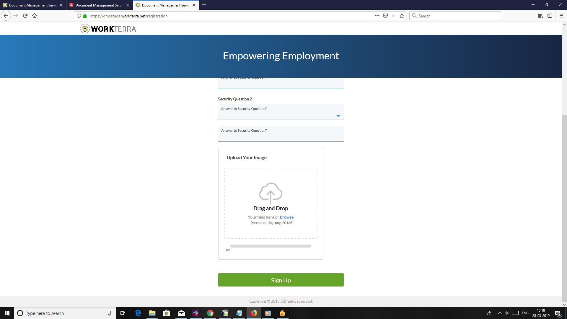
Molly's comment:
Upload your file – still seems weird to have this field / what is it for? We have no explanation to candidate.
- Either add note
- check with Aruna Raheja, whether it is required.
