-
Type:
Bug
-
Status: Done
-
Priority:
 Medium
-
Resolution: Done
-
Affects Version/s: None
-
Fix Version/s: None
-
Labels:None
-
Company:CareerBuilder
-
Epic Link:
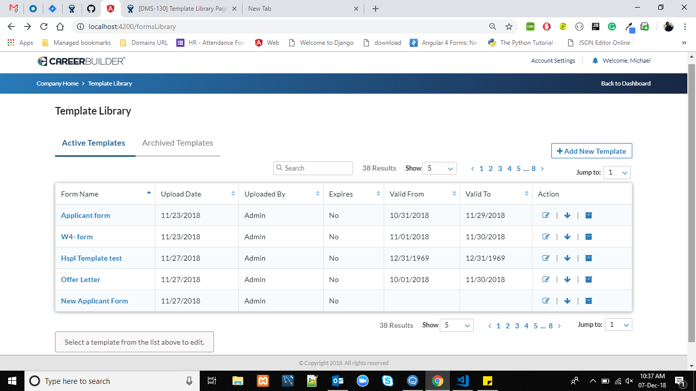
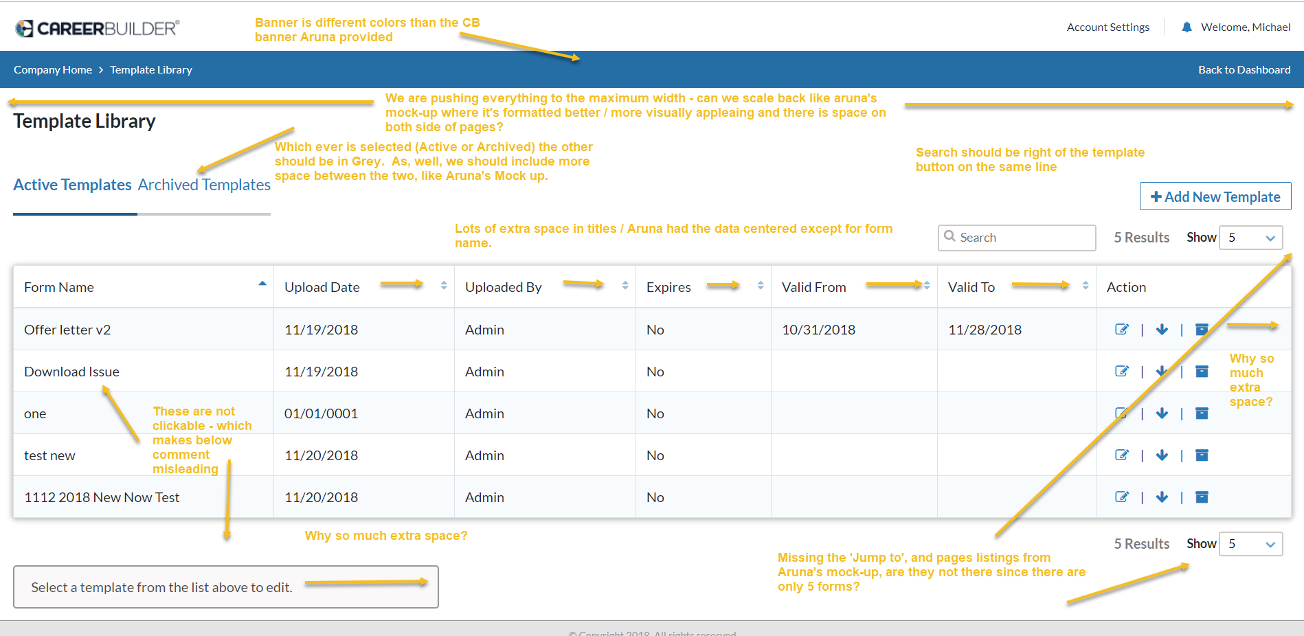
You can see more details / info on the image attached:
- Banner is different color than Aruna's mock-up with standard CB color
- Everything is being pushed to the full limit of the page, vs. providing space to be visually appearling
- Active/Archived - should grey text the one not being looked at, as well not sure if it's the same text Aruna used
- Search bar should be to the right of the add new template button / on the same line
- Column headers have quite a bit of extra space; same with the action row
- Form Names are not clickable
- Text at bottom has a lot of space, and is misleading since text wasn't made clickable
- 'Jump to' is missing above / below the chart, as well as page numbers (see Aruna's mock-up)
- Download action does not work
- If you try to delete document from archive, the message is missing 'a' - "Once a document is deleted...'
- Archived documents cannot even be clicked?