-
Type:
New Feature
-
Status: Done
-
Priority:
 Medium
-
Resolution: Done
-
Affects Version/s: None
-
Fix Version/s: Email communication
-
Labels:None
-
Company:CareerBuilder
-
Epic Link:
-
Sprint:DMS - Sprint 2, DMS - Sprint 3, DMS - Sprint 4
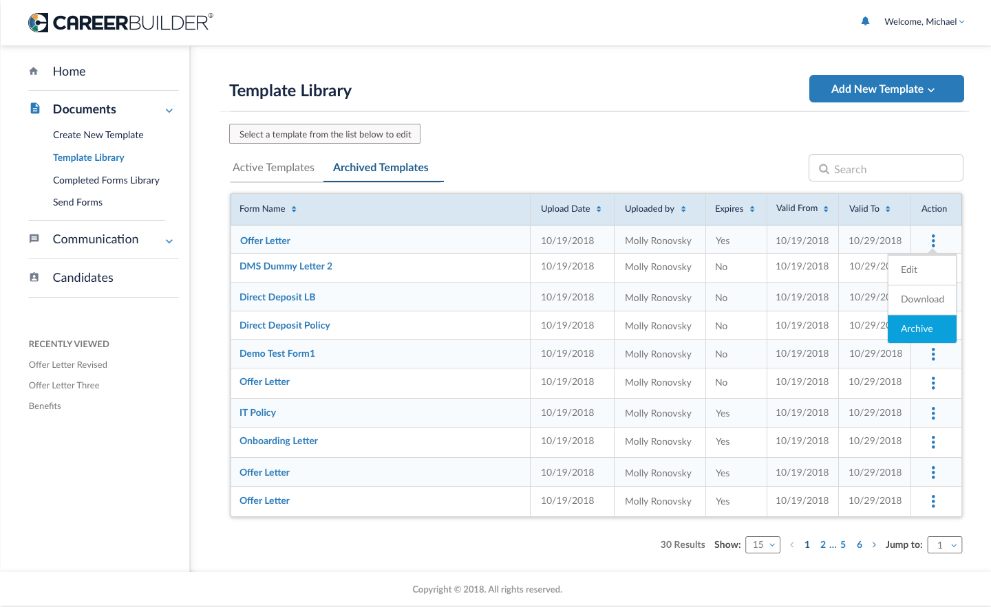
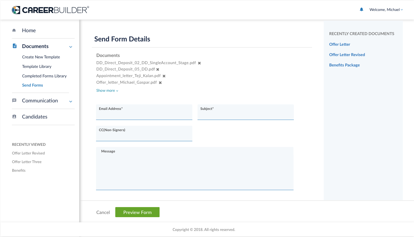
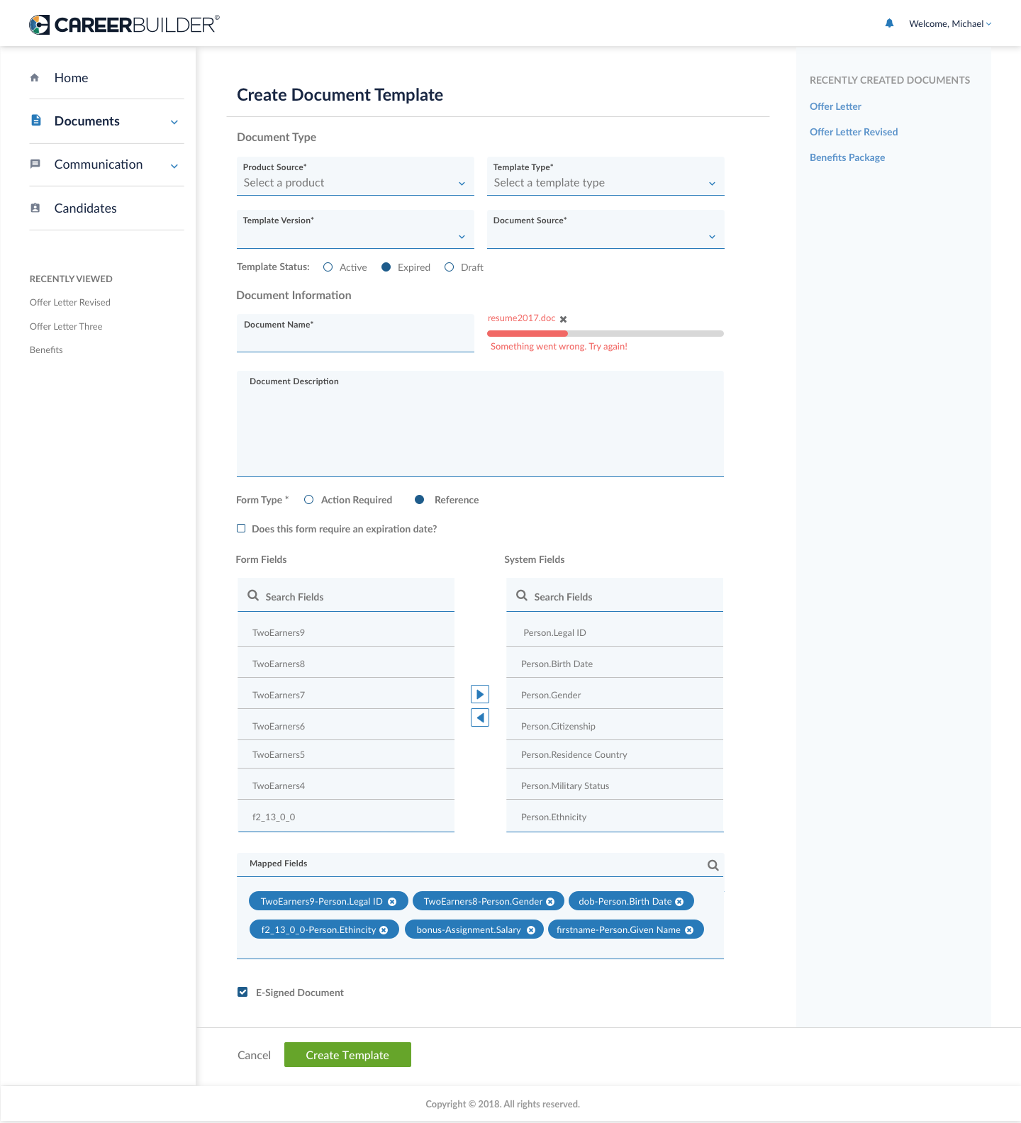
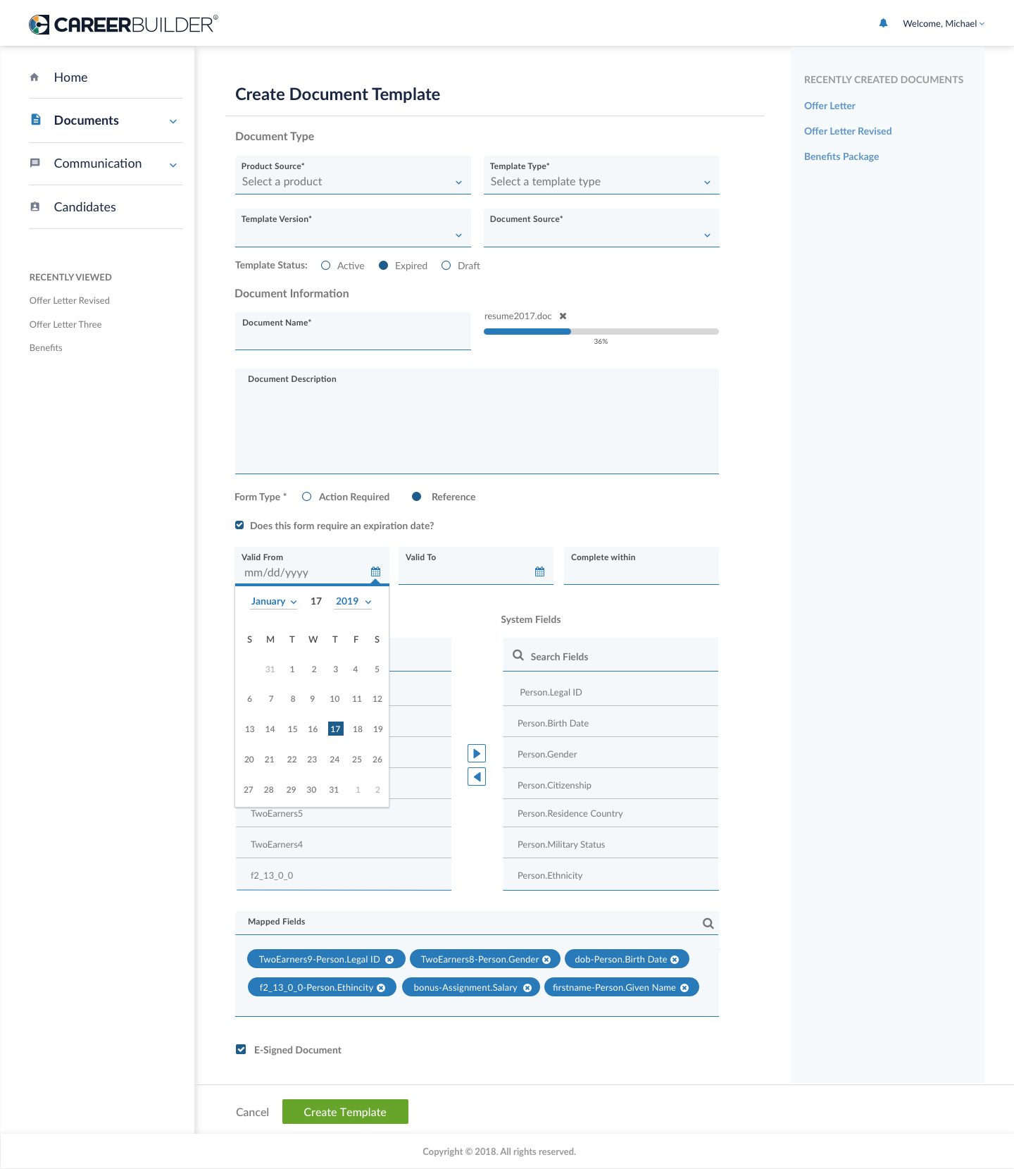
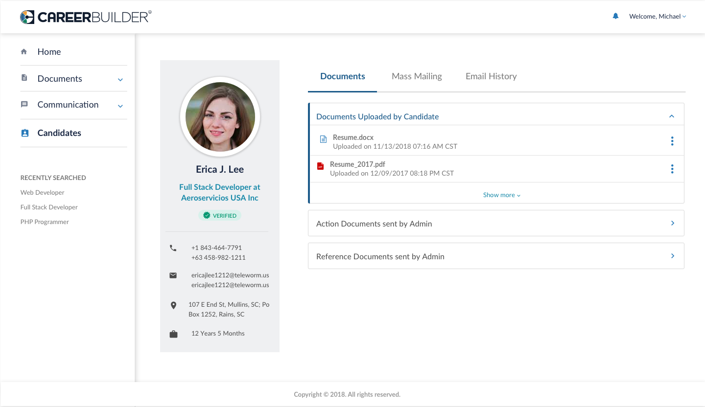
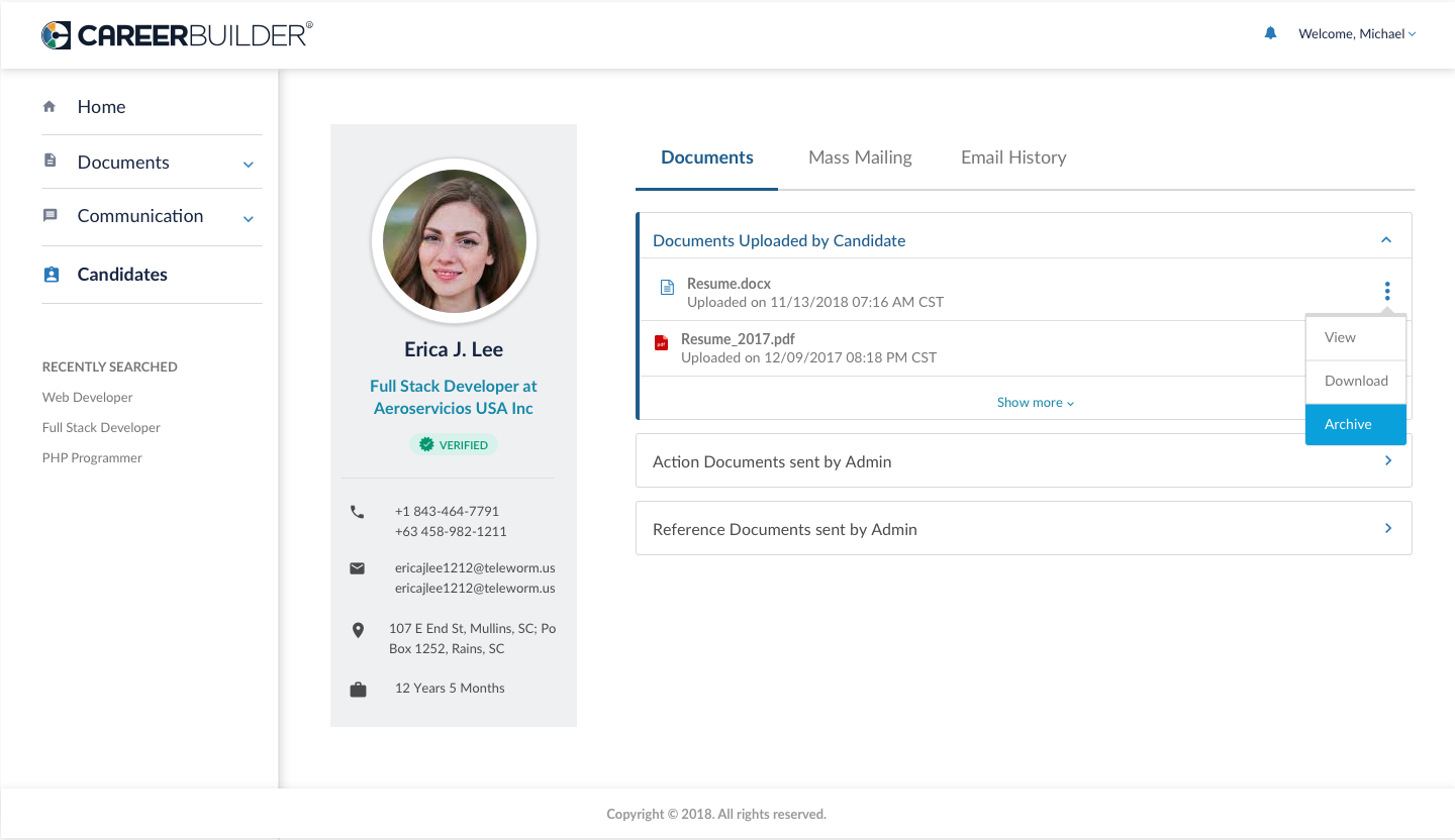
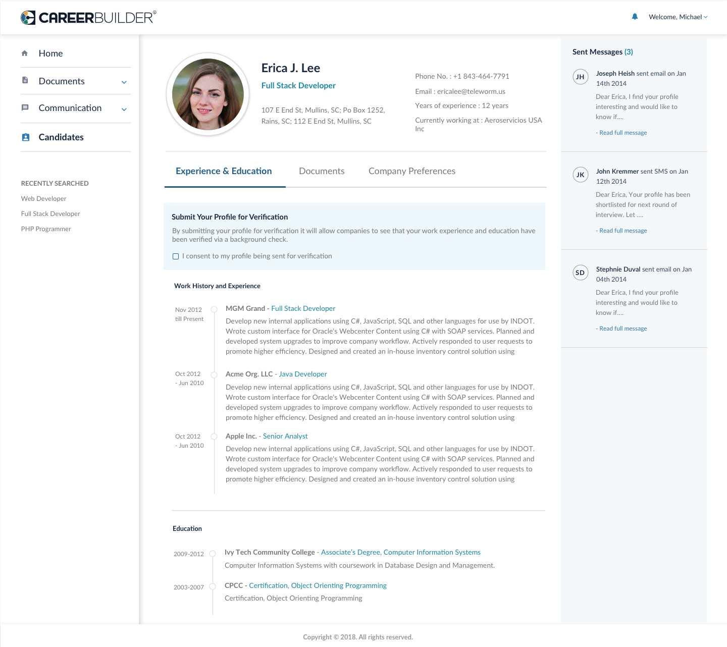
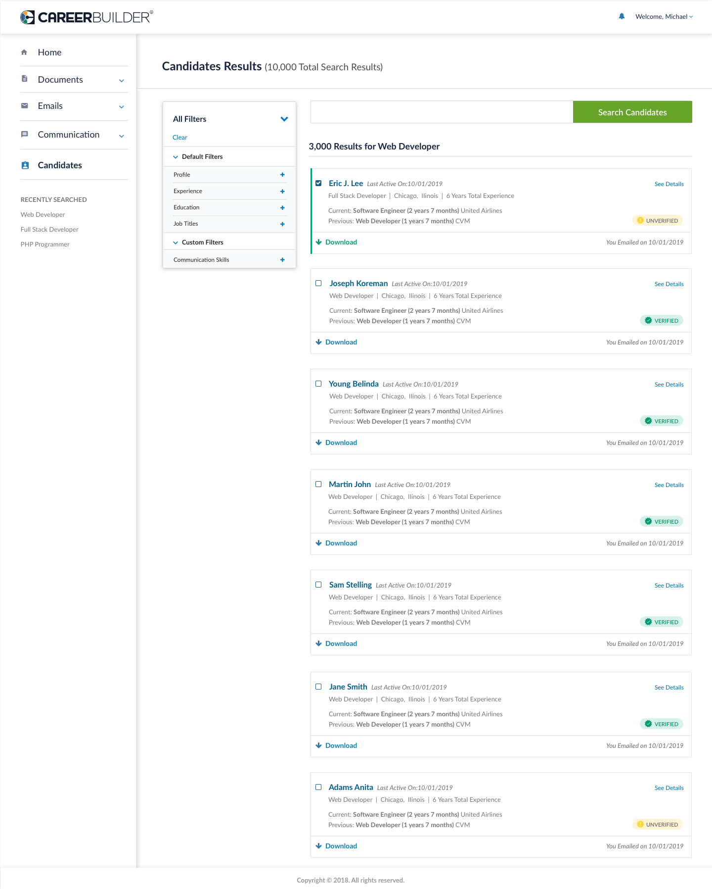
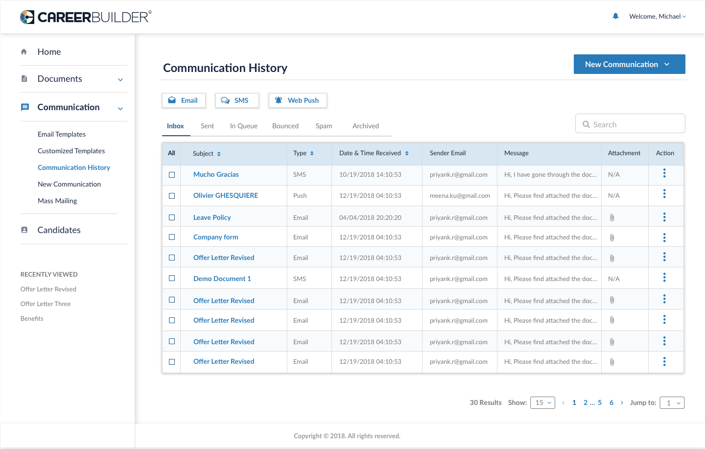
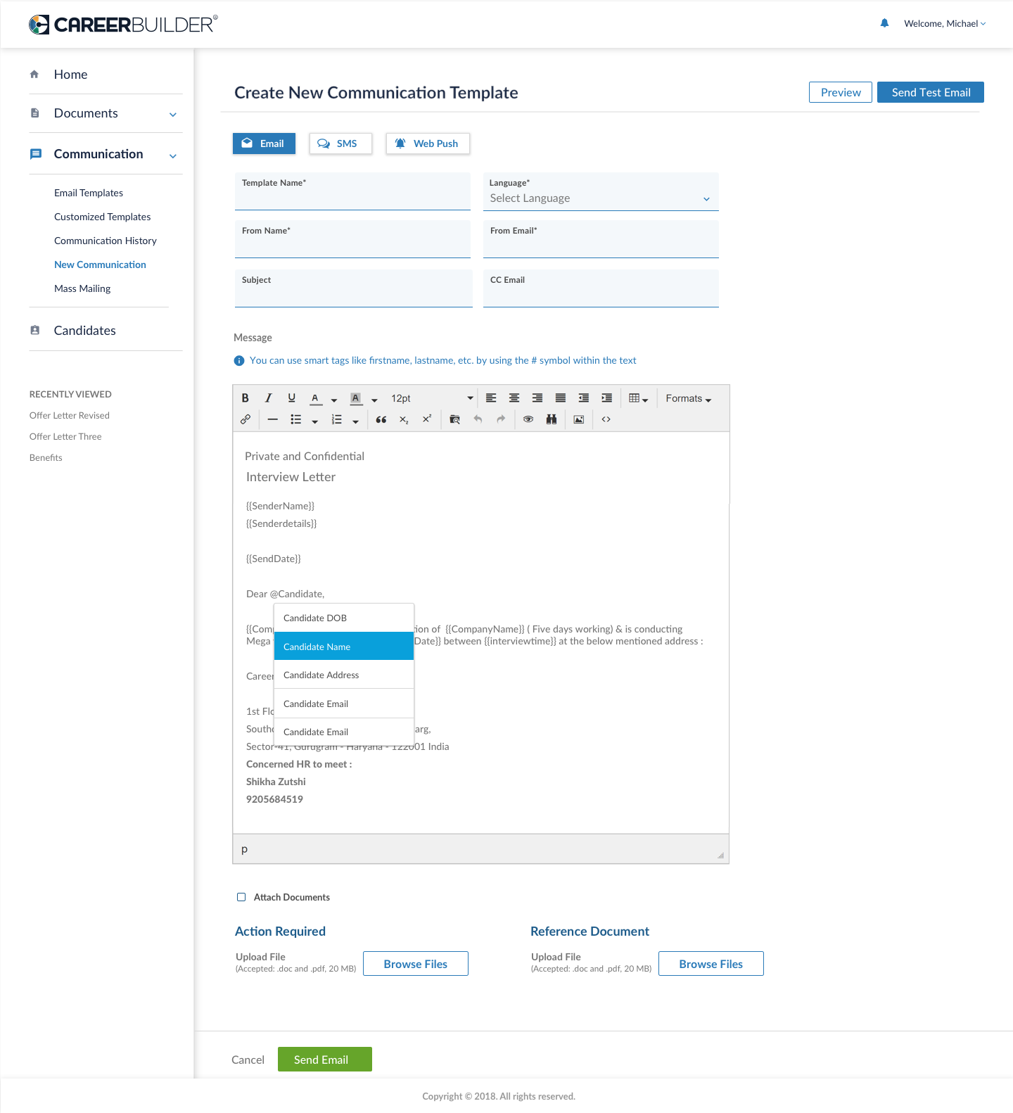
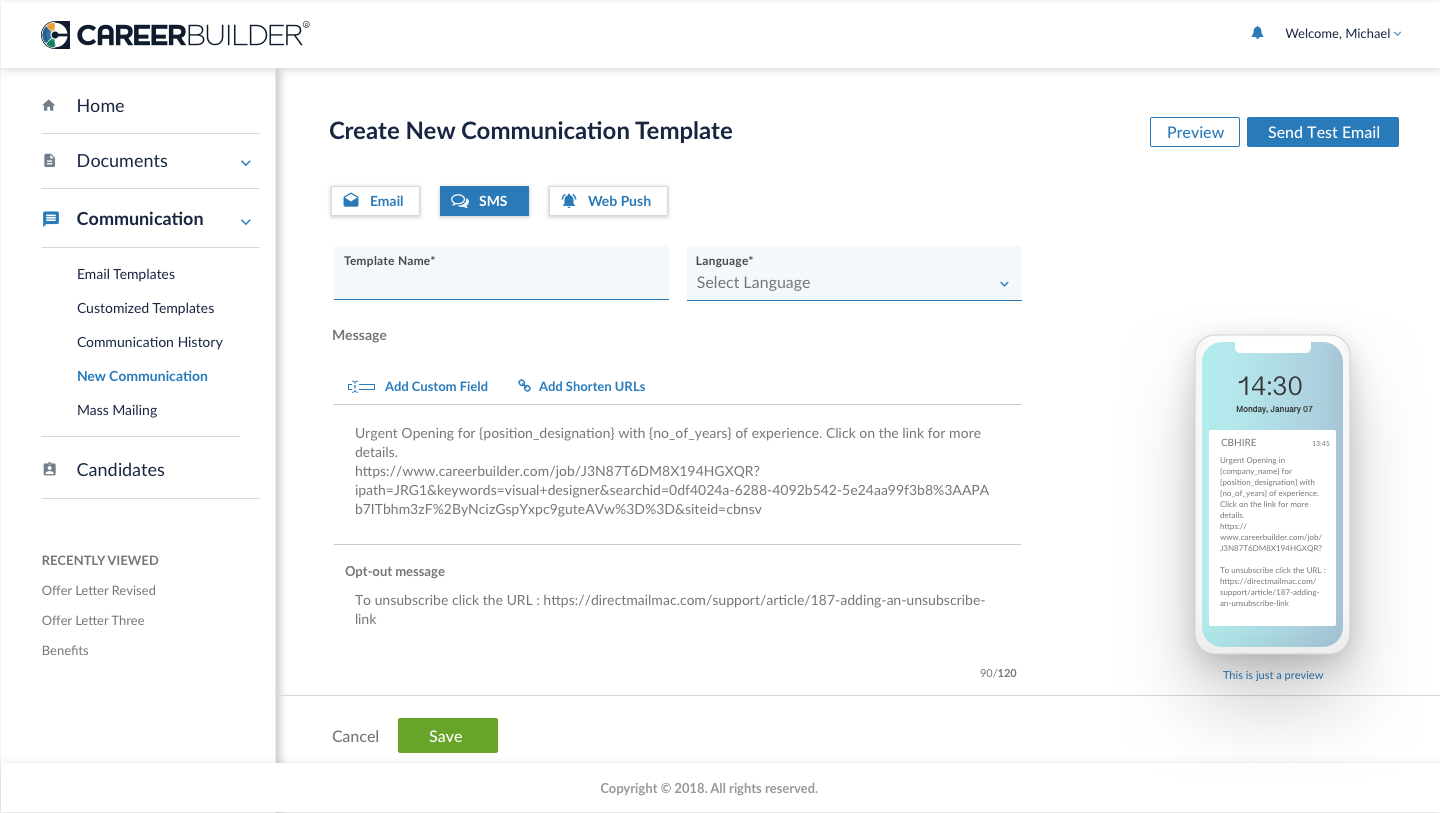
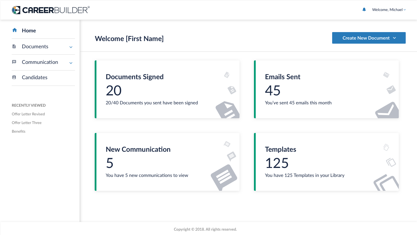
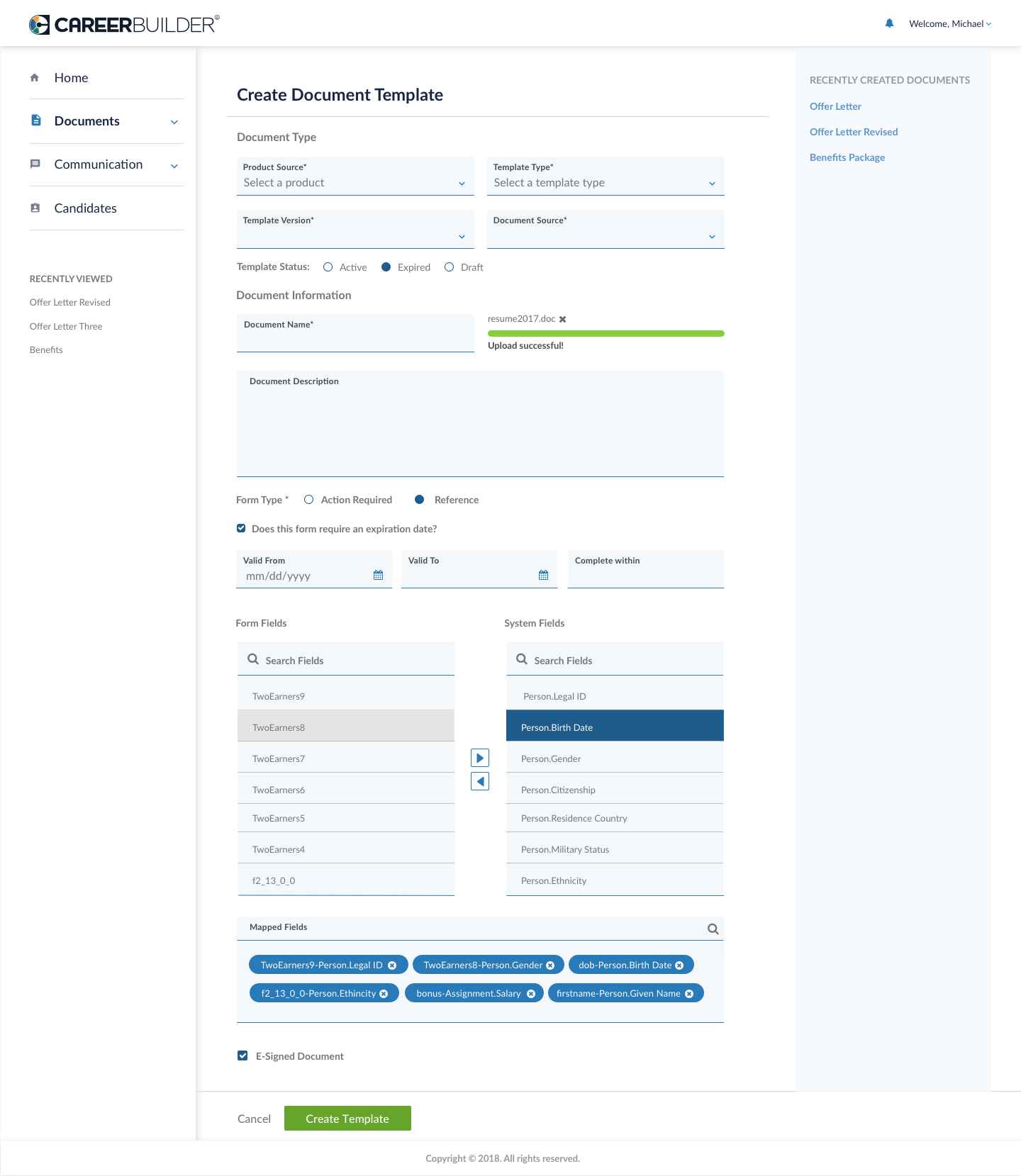
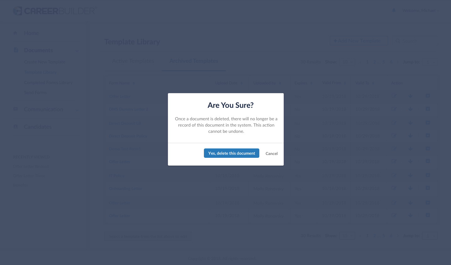
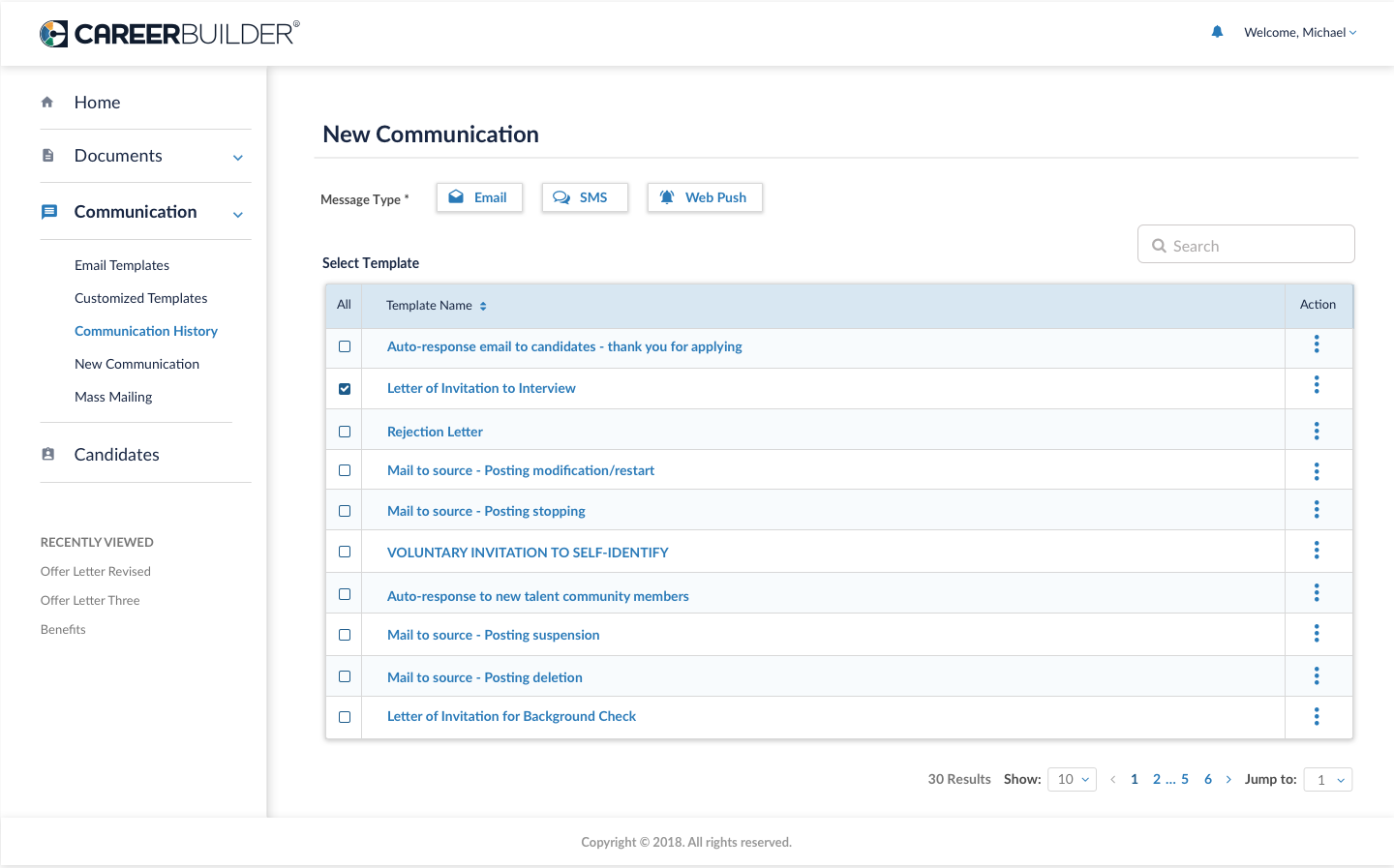
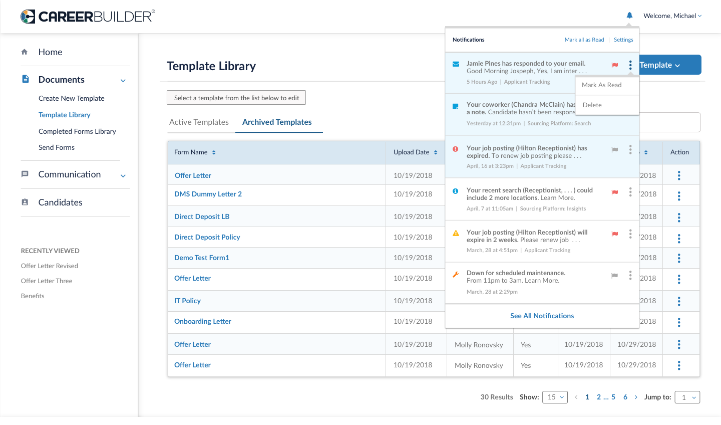
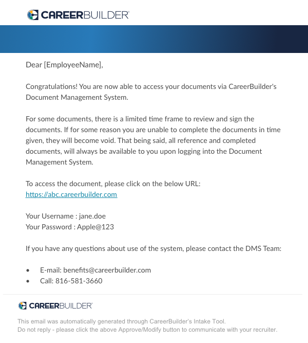
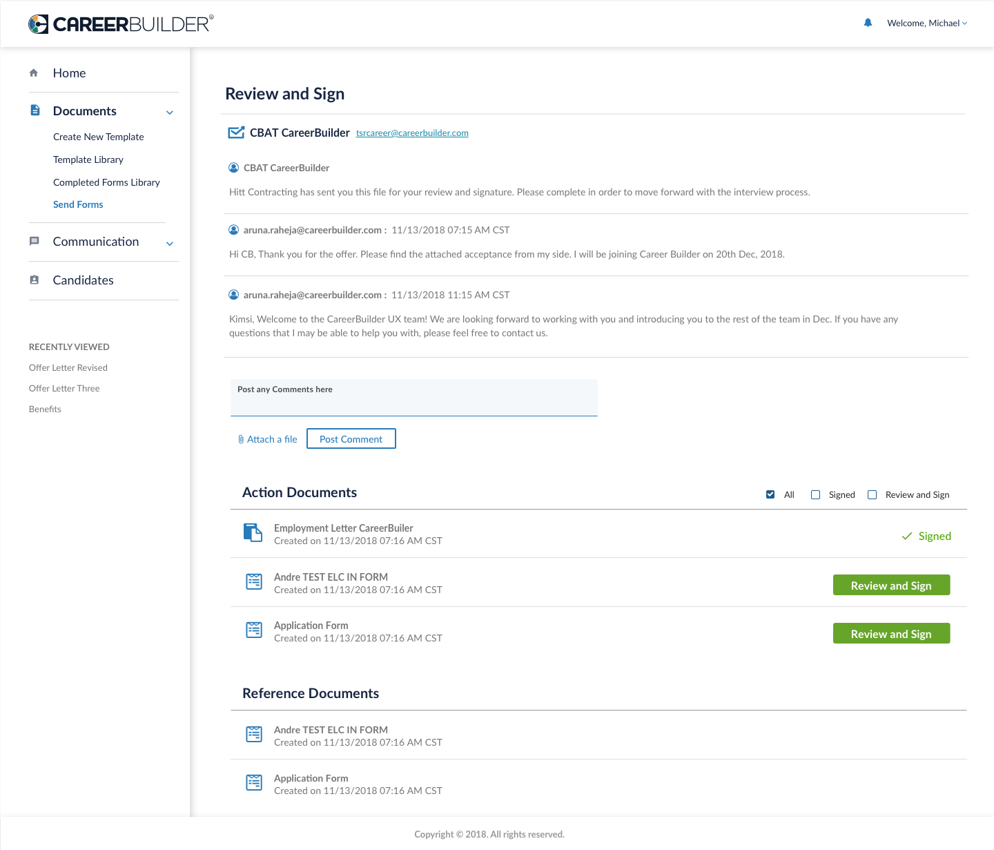
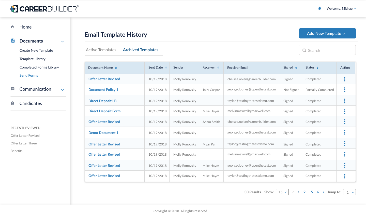
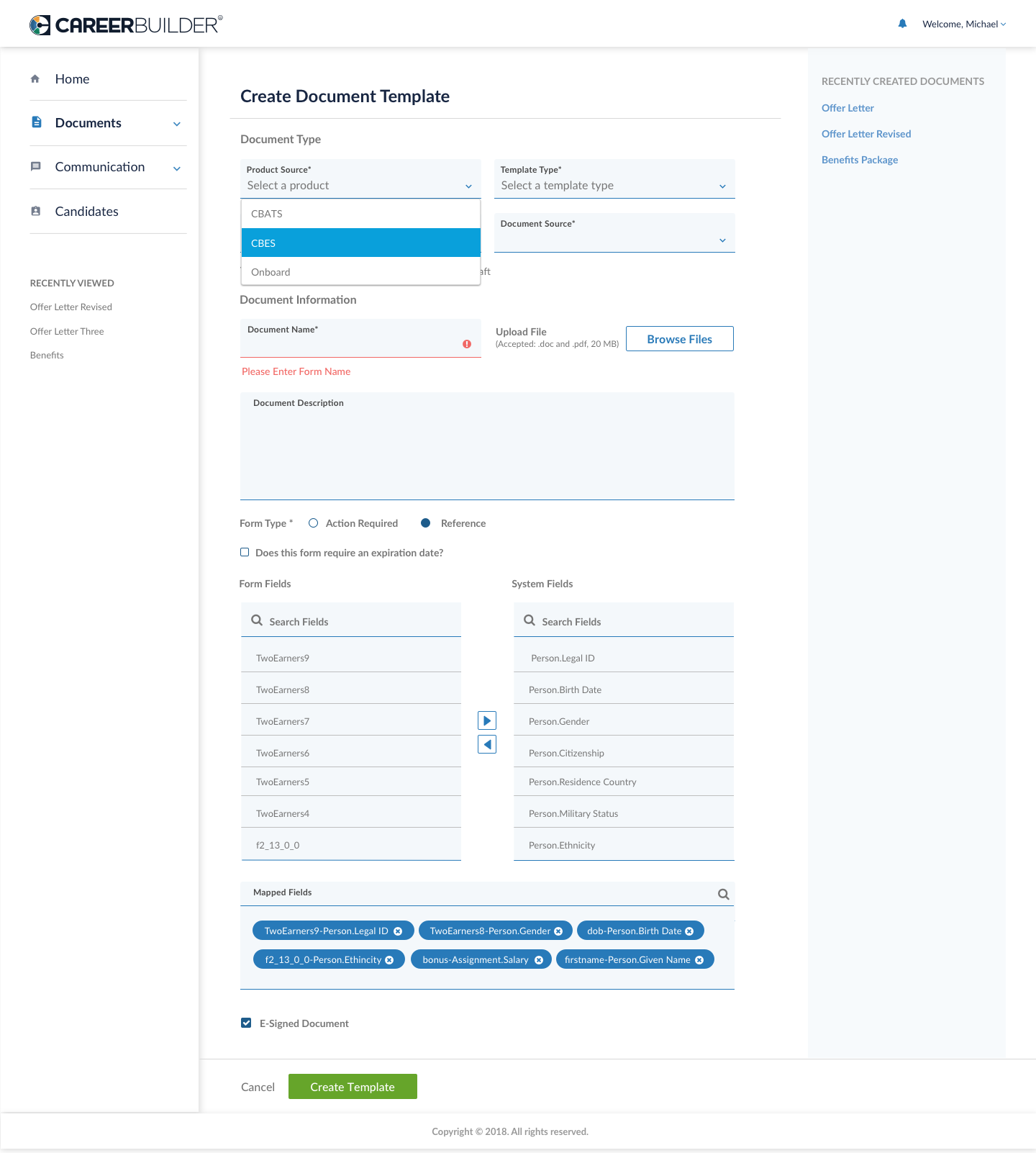
Overview:
UX to design templates that can be used throughout the DMS / integrated applications.
Entry:
- User navigates to DMS platform
- User sees consistent and seamless branding throughout.
Acceptance Criteria:
*IF I am in the DMS, I see consistent pages throughout the system.
- IF I am in the DMS, I feel the consistency and intuitiveness on each page .
- IF I am in the DMS, I see that concepts from page to page carry over for easy of use.
Exit:
*User exits / logs out of the DMS platform.
Prerequisites:
N/A