-
Type:
Change Request
-
Status: Closed
-
Priority:
 Low
Low
-
Resolution: Done
-
Affects Version/s: None
-
Fix Version/s: None
-
Component/s: UI Refresh
-
Labels:None
-
Environment:Others
-
Module:BenAdmin - Enrollment
-
Reported by:CareerBuilder
-
Company:El Dorado
-
Item State:Stage QA - Production Deployment on Hold
-
Severity:Simple
-
UAT For:UI Refresh
Credentials: NICHOLAS T ADAIR | adair5301 | Password@1 | El Dorado
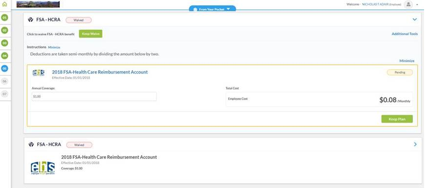
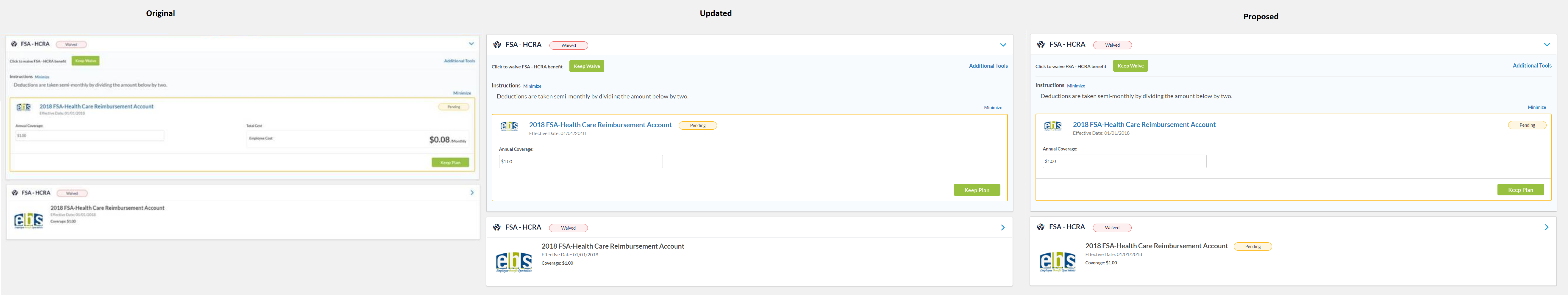
Comments: For FSA-HCRA, it was originally waived. I enrolled with $1 coverage. On expansion, I can see the Pending button for $1. However within collapsed view, it is showing Waived button but with coverage of $1.00. For the collapsed view, wondering if we should either
- Show the Pending button beside the plan name or
- Show a text of ‘Enrollment Pending Approval’ beside the ‘Waived’ button
- Show a text of ‘Enrollment Pending Approval’ beside the Coverage amount
How does the team feel about this?