-
Type:
Change Request
-
Status: New Request
-
Priority:
 Low
Low
-
Resolution: Unresolved
-
Affects Version/s: None
-
Fix Version/s: None
-
Component/s: UI Refresh
-
Labels:None
-
Environment:Others
-
Module:BenAdmin - Enrollment
-
Reported by:CareerBuilder
-
Company:El Dorado
-
Severity:Simple
-
UAT For:UI Refresh
Credentials: NICHOLAS T ADAIR | adair5301 | Password@1 | El Dorado
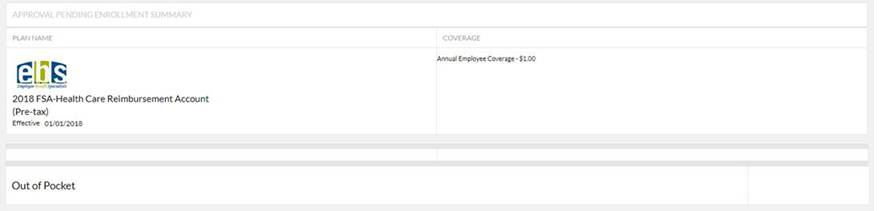
Comments: For ‘Approval pending Enrollment Summary’ section under Confirmation Statement, there are multiple areas of formatting inconsistencies
- The text under ‘Coverage’ section seems smaller than second column of other tables. Please standardize and use the same font format.
- It appears that the setting is not to show cost. As such, the (Pre-tax) text looks odd. I am recommending to always show Employee Cost so it will remain relevant. If not defaulting to show cost, then (Pre-tax) should be hidden when cost is now showing (less preferred).
- It appears that the setting is not to show cost. As such, there is seemingly an extra block above ‘Out of Pocket’. I am recommending to always show Employee Cost so it will remain relevant. If not defaulting to show cost, then this block should be hidden when cost is now showing (less preferred).
- It appears that the setting is not to show cost. As such, the ‘Out of Pocket’ section is blank. I am recommending to always show Employee Cost so it will remain relevant. If not defaulting to show cost, then this block should be hidden when cost is now showing (less preferred).
- is cloned by
-
-
- New Request
-
